The UX Challenge
I was approached by a developer who had created an app for musicians and music lovers to create song lists and keep track of their music groups. He had created a mockup of how he had imagined the app working, but wanted me to see if I could improve the UI with some visual design and streamlined flows.
The UX Approach
I began with some sketches that implemented a navbar into the bottom of the screen to improve ease of access for users. I also sketched some ideas for a logo/app icon and, based on feedback from the client and peers, moved forward with building the app icon and logo in Figma. Using the client's original mockup as a starting point, I created a wireflow of how I could see the app progressing. The style guide I created utilizes an organic blue/green color palette and slightly rounded shapes. When I picture visuals to go with the concept of music, I tend to imagine unpredictable and curvy, yet sleek, shapes. Kind of like Matisse's paper cut-outs.
The Final Product
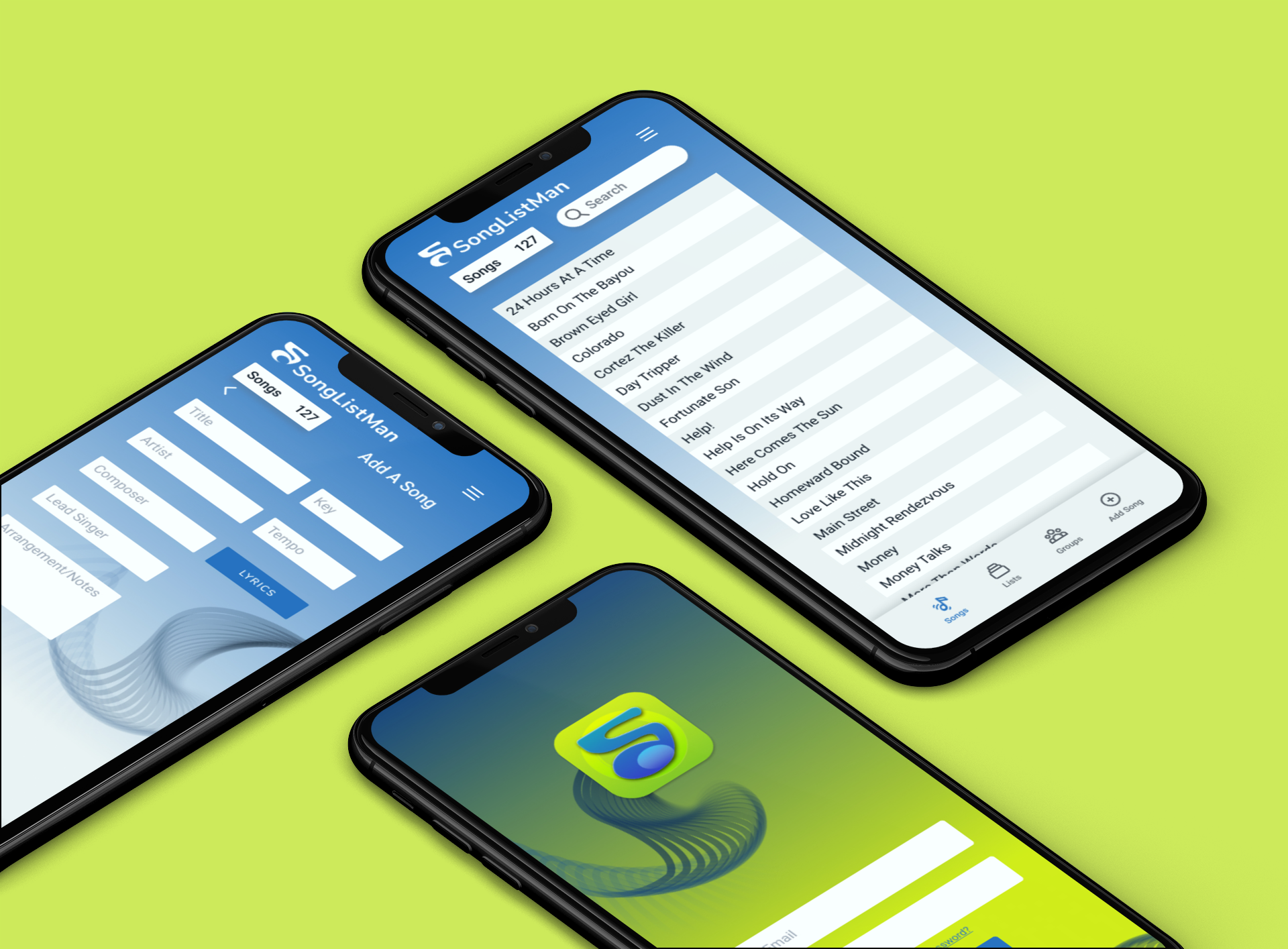
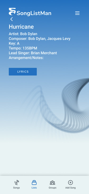
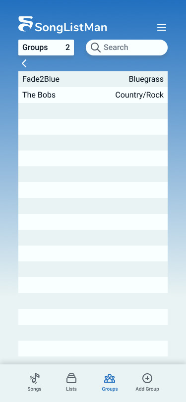
Many changes were introduced as I went through prototyping. As I learned more about the intent of the product, new ideas or important inclusions would spring to mind and I began seeing a need for the addition of various modals for alerts and the ability to store and edit group/member information. The final prototype enables users to store songs in their account, create lists, along with adding new songs, groups, and members. I tried to keep flows straightforward and minimal in their approach to create a delightful and intuitive experience.
The UX Impact
The client was very pleased with the UI redesign and the UX changes that I suggested. Further testing and a deeper implementation of account/profile details are on the horizon to make this an even more solid product. At that point, the client will begin implementing my designs into the development process.
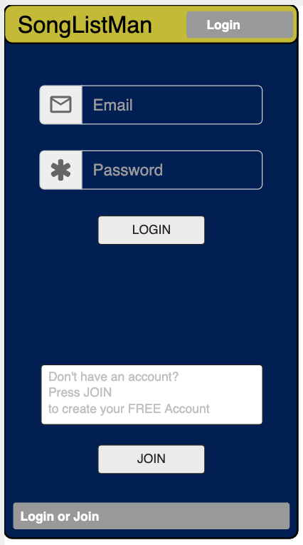
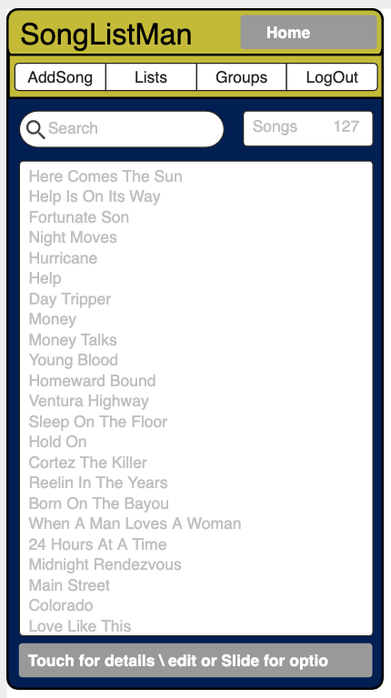
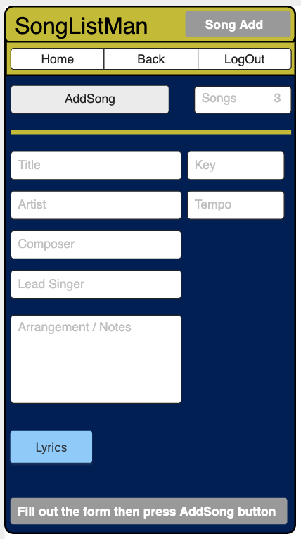
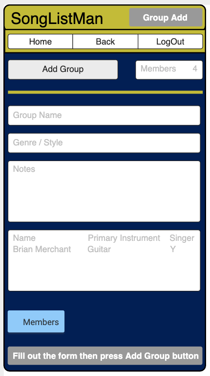
This is the mockup the client created and gave me to get an idea of how he wanted the app to work. This was great to have as a starting off point because it enabled me to really visualize various flows and to create a list of features that I needed to include in my design plans.
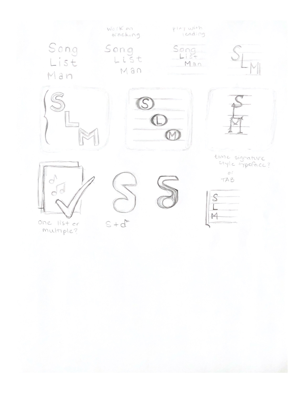


On the left, you can see my initial sketches where I began brainstorming app icon/logo ideas for SongListMan. I ended up feeling really drawn to the icon where I combined an S with a music note. Using Figma, I built the design. I originally thought the icon was too angular and needed to be smoother, more organic. So, I edited the shape and ended up with the final designs shown on the right.
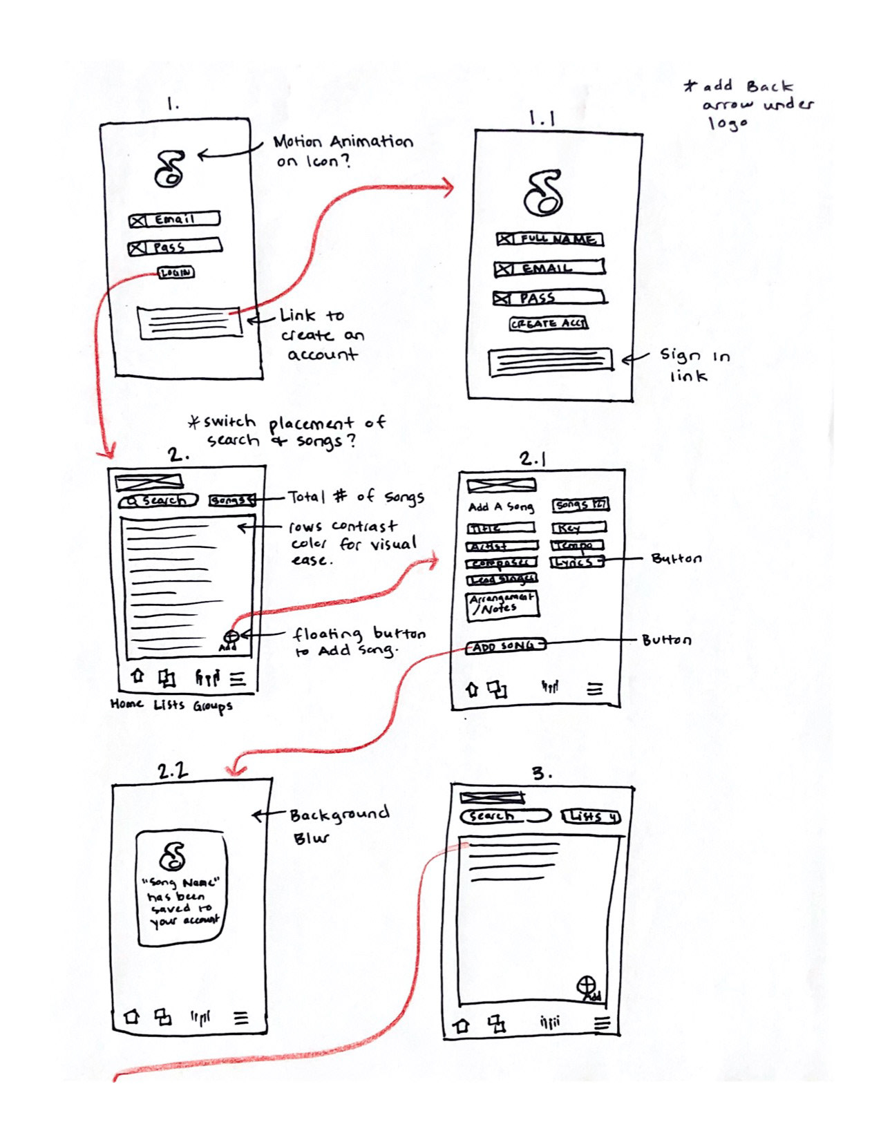
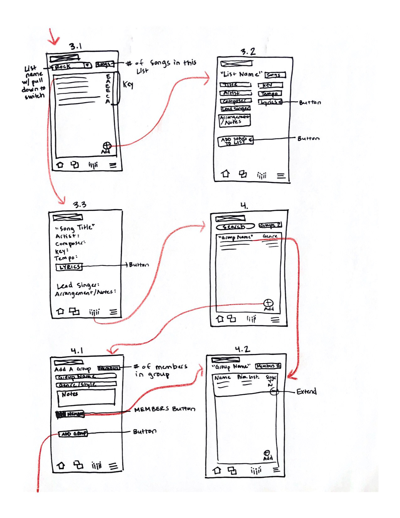
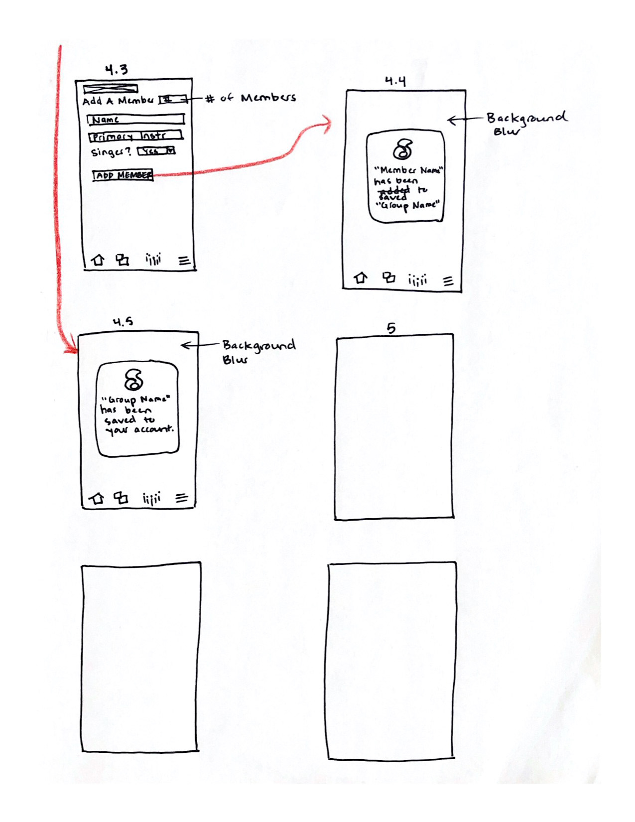
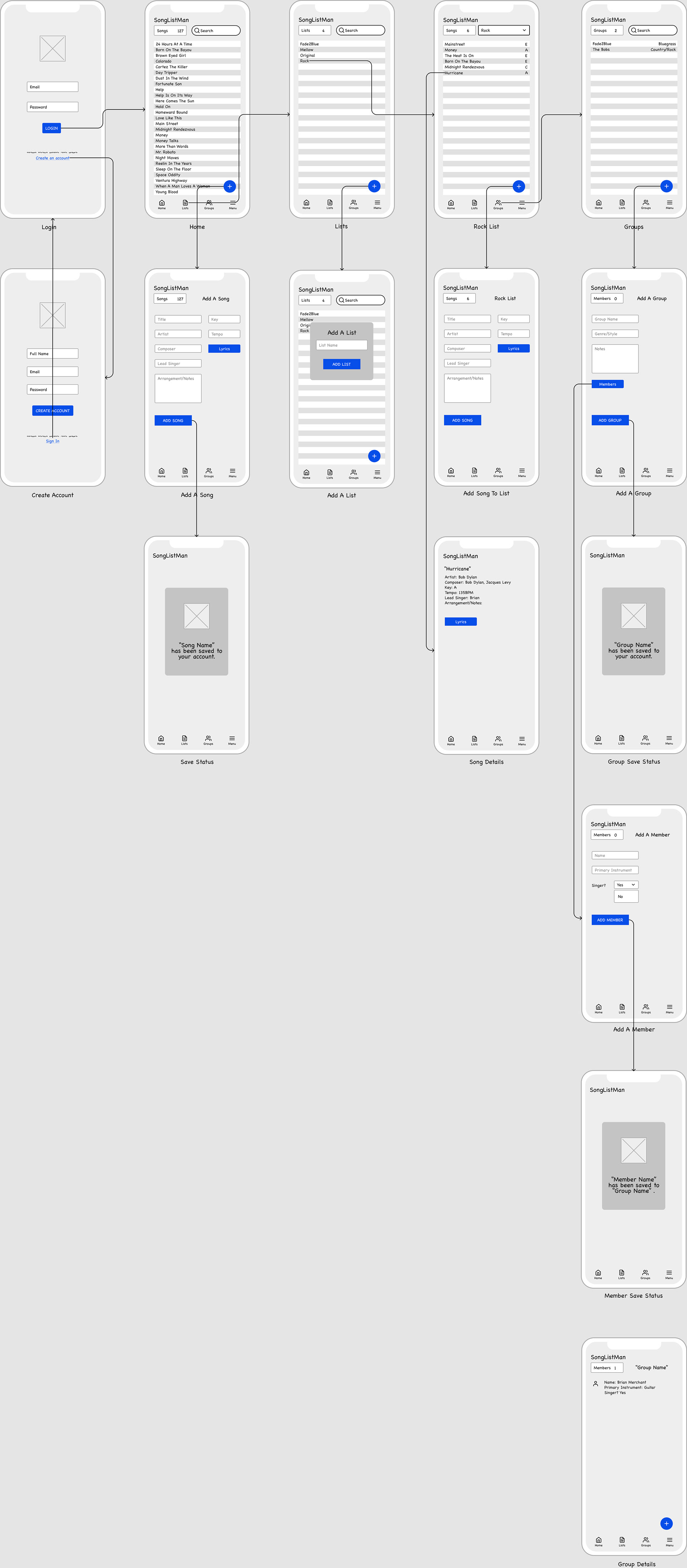
Sketching the wireflow helped me to envision the composition and functionality of the app. This is also where I started seeing places where modals would be beneficial.
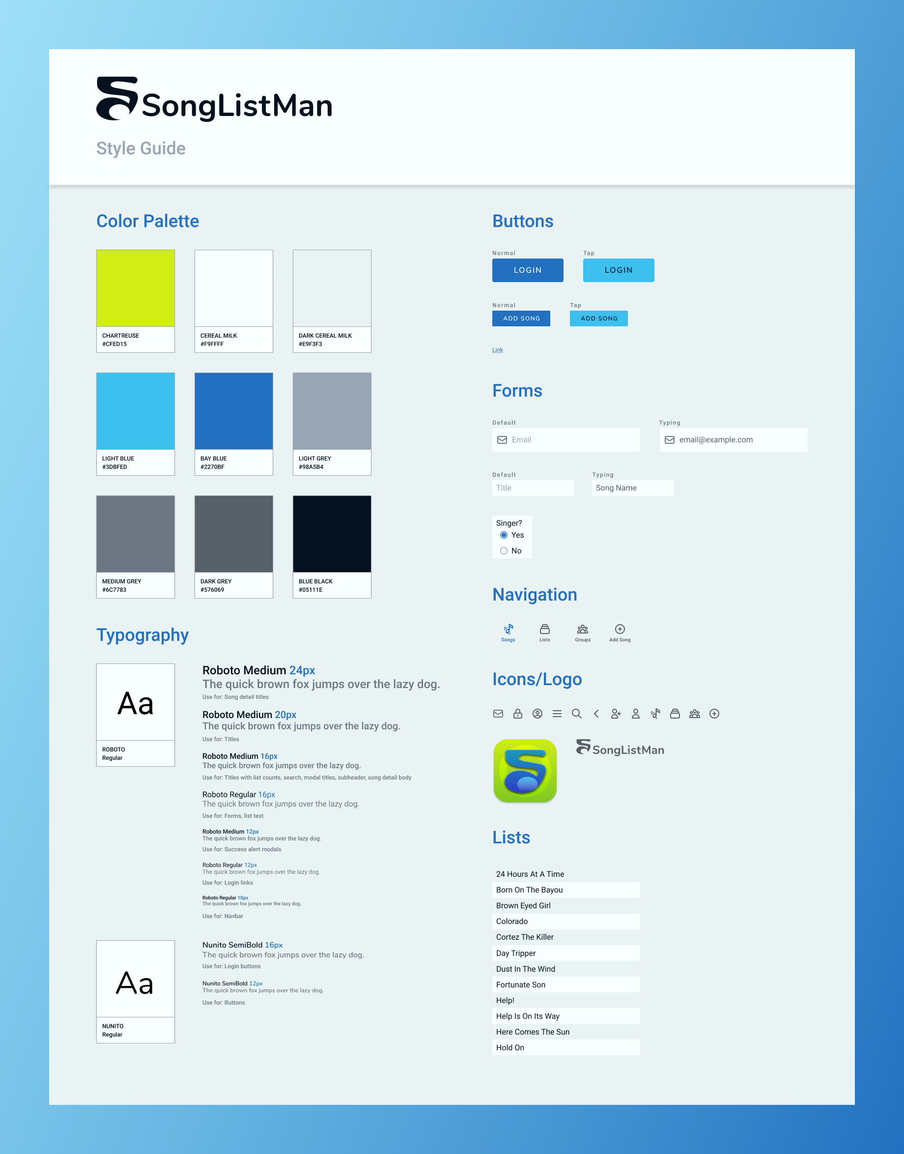
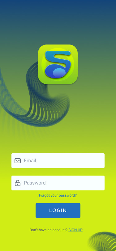
I wanted the visuals for SongListMan to be calming and fresh, while still being vibrant. I added in the chartreuse to bring a little zap of energy, but it is used sparingly. It is really only used on the login screens and for modals, as I do feel the bright color seeks the attention needed for alert messages.
I felt Roboto and Nunito paired nicely for typography and were both very modern without being hard-edged, which would not have fit the organic style I was going for.

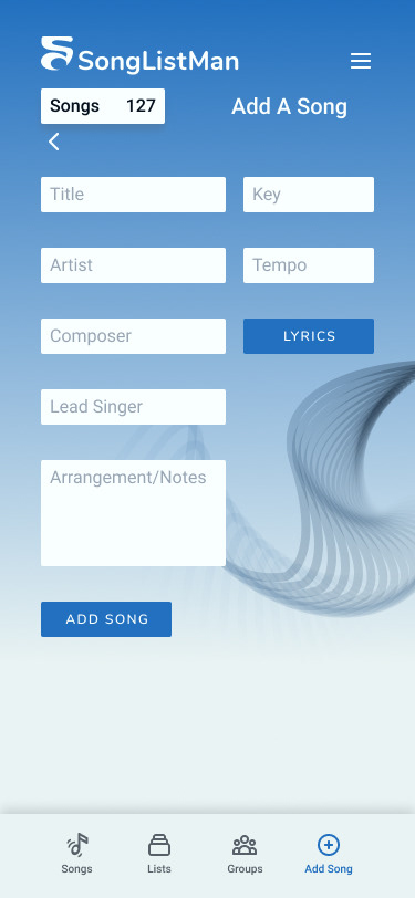
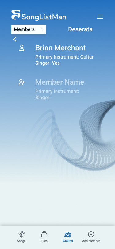
The prototype brought all of the visual design together. I ultimately ended up making the add button a part of the navbar because it was such an integral part of the user experience. It became clear it is used more often than the hamburger menu because of the vast amounts of different types of information that can be added to the app (i.e. songs, groups, lists, members). So, I moved the hamburger menu to the top right to make room for the add button in the navbar where it would be easier to reach.
The client is currently developing the app with these designs. We have discussed further collaboration to beef up the member profile and account details portion of the experience at some point in the future.