
The Ask
This course was originally three separate lessons, and I was tasked with updating the course to a single-page format. Recent testing had shown that a single-page format performed better with users and would also provide more benefits towards our SEO goals.
The Partnership
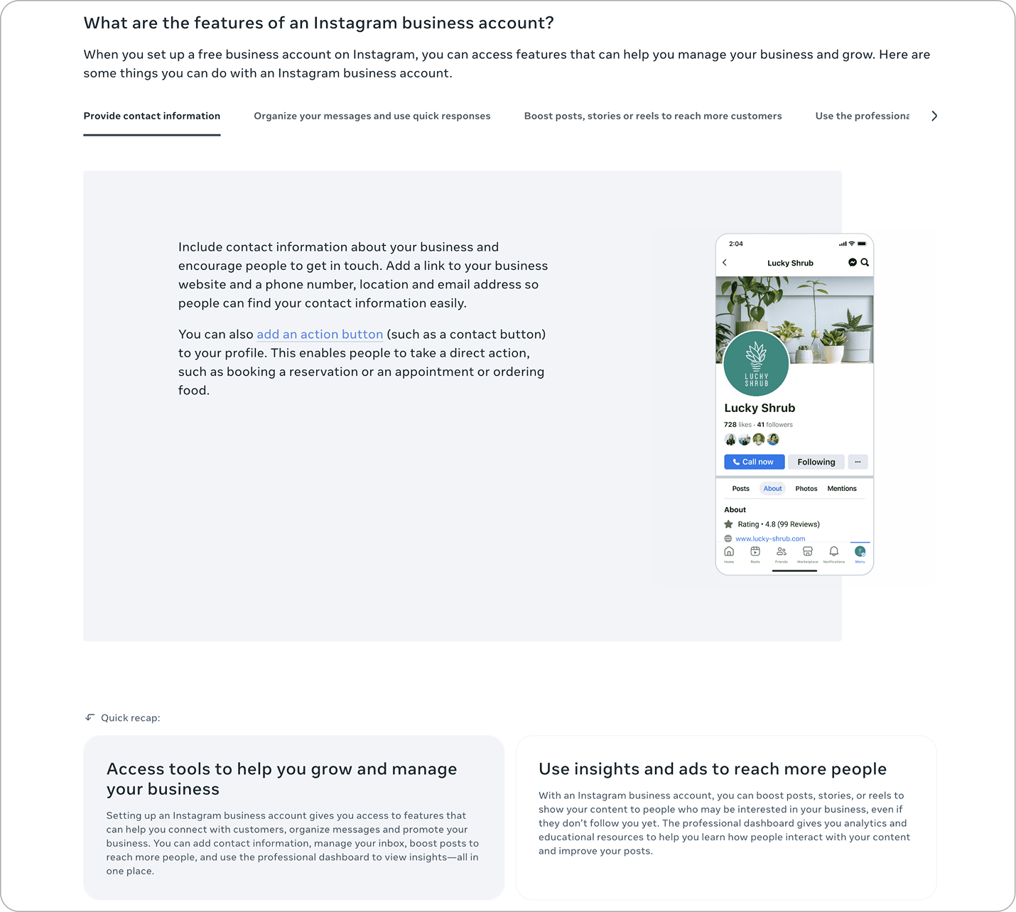
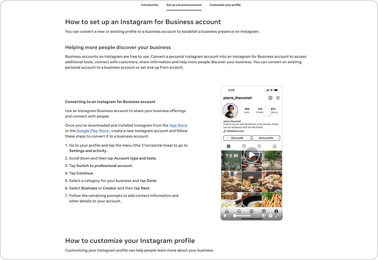
One of the teams I worked with on this project was Learning Design. The Learning Design team writes all of the copy and content for the courses. They provide me with a storyboard that I use as a blueprint for building out the course. We work together to determine the best format for the content, and which components work best within each format. This includes deciding which types of assets are best for each part of the course. On any given course, I create videos, hero images, UIs, illustrations, infographics, and icons to use in storytelling.
The Plan
The initial plan was to take these three separate lessons and combine them into one page, with some copy updates for steps that had changed. Minimal content changes, just a format shift. I began working on V1 of the course, including the "Quick recap" sections that had been key takeaways at the end of each one of those lessons.
The Problem
What became clear with V1 was that the content as is felt too short to justify three separate "Quick recap" sections, within the single-page format. And reviewing all of the copy together in one page made it clear there were topics that were covered in a few different ways, making some instances feel redundant. It also felt like the main journey of setting up a business account was getting a little lost because of the repetitive topics. Some of the information that was very important in the multi-page format was now causing confusion, both in the visuals and the copy.
V1 had these "Quick recaps" at the end of each section. They were based on the original lesson key takeaways, but felt excessive in the single-page format.
The Pivot
The first thing I decided to do was to combine the "Quick recaps" into one concise "What you learned" section at the end of the page. This reduced some of the repetitive content and released some visual tension created by the quick recap boxes in quick succession.
This also seemed like a great opportunity to have CTAs for Instagram, which the course did not have before. So, I placed a CTA in the top banner and one again at the end of the course near the key takeaway section.
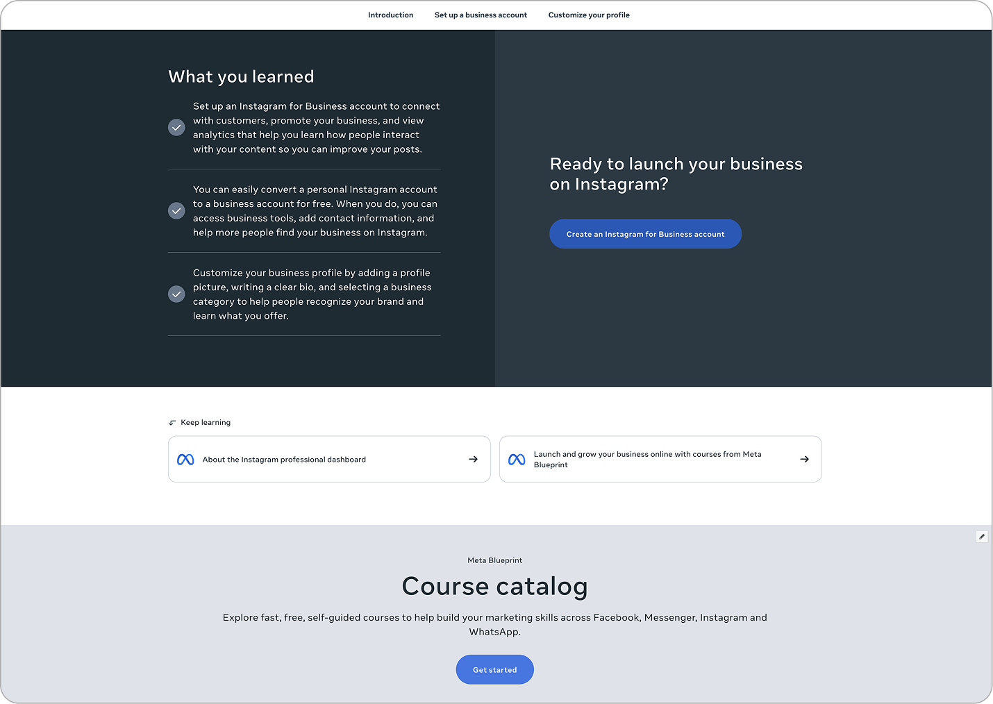
V2 combined the "Quick recaps" into one "What you learned" section at the end of the course, making a more streamlined experience and concise content.
The Process
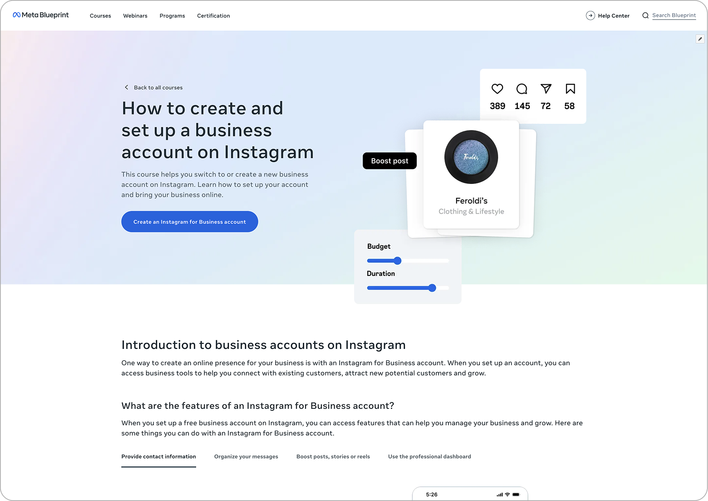
As part of the course creation process, I create all of the assets needed to ensure the course objectives are clearly communicated with visual scaffolding. After building the shell of the course and placing all of the copy from the storyboard, I created all of the UIs and a video walkthrough using Figma and After Effects. I also designed the hero image to highlight the benefits of using an Instagram business account with bits of stylized UI.
The Outcome
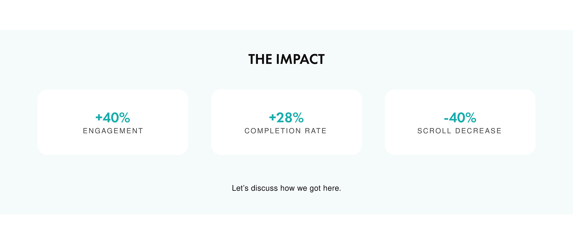
The changes I implemented had a very positive impact on the course. I was able to decrease the amount of scroll on the page by 40%, while maintaining the same concepts. The clarity of the goals and visual presentation of the objectives led to a 40% increase in engagement, and also boosted the course completion rate by 35%. I believe these changes will have a ripple effect as more courses are brought into this single-page, short-form template.
The Lesson
Sometimes, less is more. I learned that retention can be greater by trimming areas that begin to feel repetitive, as long as you can maintain the ideas that are important to your goals. This also rings true in visuals. A stylized UI is sometimes the best way to catch the eye and communicate a concept in a way that is more inviting.